Energy consumption data
Live(ish) energy demand and supply charts. These show data collected over the past ten days.
Contents
Minute by minute energy demand
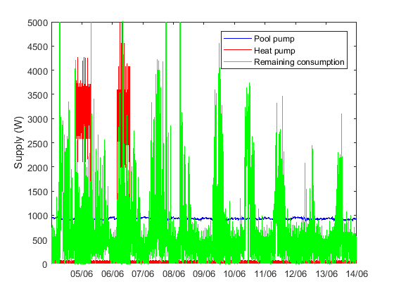
The figure below shows the recorded heat pump and pool circulation pump consumptions. It also shows the remaining consumption (mostly within the house). This is derived by subtracting the heat pump and pool circulation pump consumptions from the total power supplied from solar pv and the grid. This approach fails when the property is exporting, as the quanty of export is not recorded.
Minute by minute energy supply
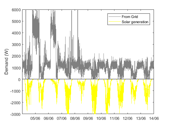
The next figure shows the energy supplied by solar pv and the grid, again on a minute by minute basis. The key purpose of this plot is to show how frequently the property exports energy. The electricity meter used to record grid consumption registers zero during export, and so periods when the grey line hits the black zero line are periods of export.
Daily energy demand and supply
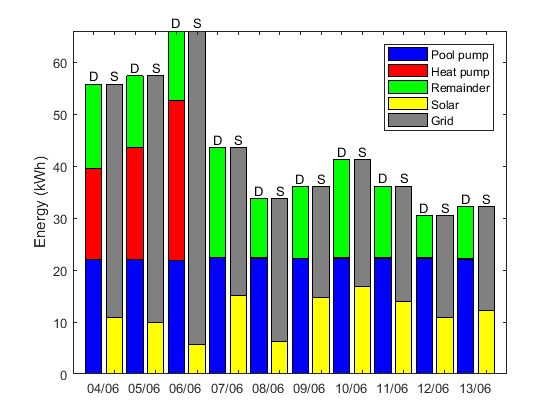
This figure shows the relative magnitudes of the daily energy flows to the different areas of consumption and also from the two supply sources, over the past ten days.
Financial interpretation of demand
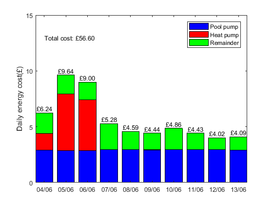
Since the cost of energy varies with the time of day, the financial implications of a given consumption pattern do not necessarily align with the amount of energy used. The figure below shows the cost of the energy consumed, based on an EoN Economy 7 tariff.
Financial interpretation of supply
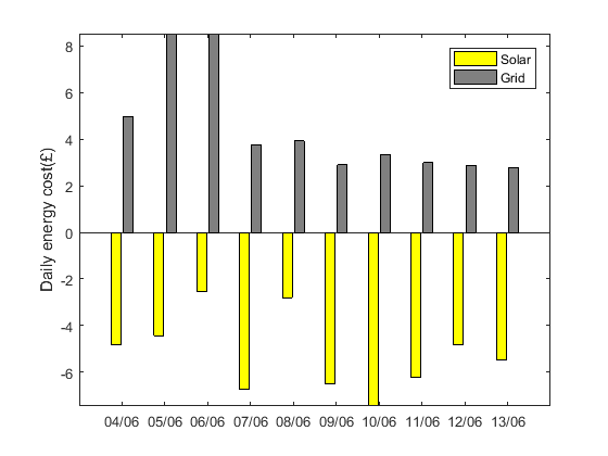
Out of interest the final figure shows the 'costs' of the energy from the two sources of supply: the grid and the on-site pv array.
